
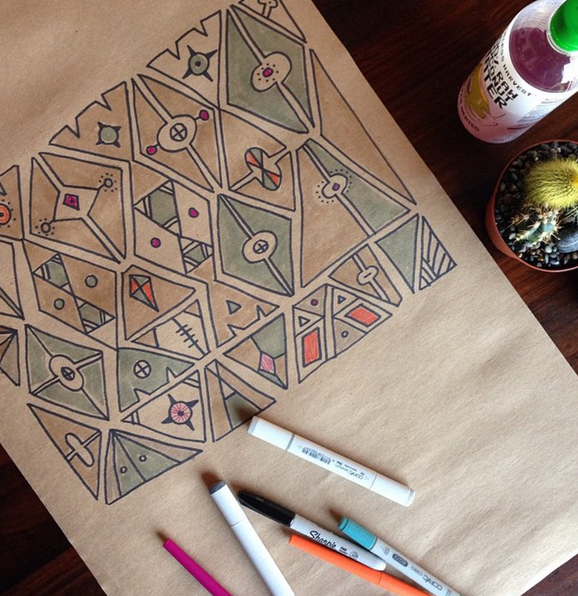
If you follow me on Instagram, than you may have seen this sketch that I was working on yesterday…Well I thought it would make a great wallpaper so I thought I’d make a spec illustration…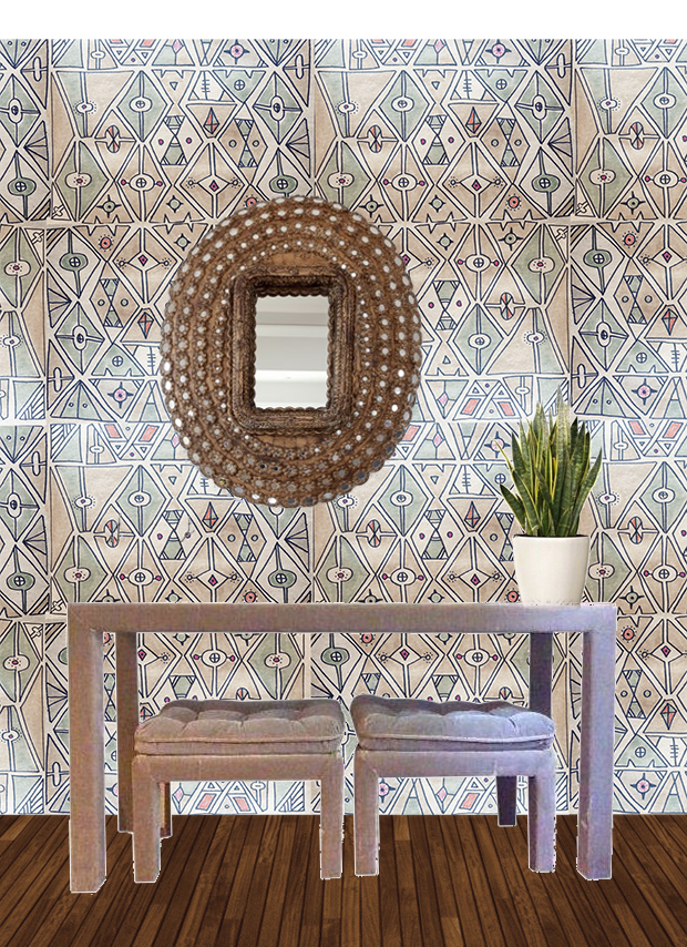
And I tried it in a greyscale as well…
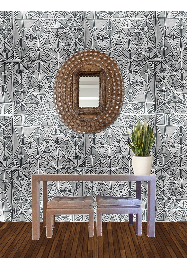
Pretty fun, right? Which color do you prefer?
I love the pattern! And out of the two, I prefer the color. It’s not too much.
the colored one!
I definitely like the coloured one the most – it makes sense with that type pattern to have those muted tones – it’s lovely, are you going to have it made? Silkie x
I like the color one!
What program did you use for overlapping?
photoshop :D
the color one! very midcentury modern
This is super cool!! Love it in color. I could see you doing a whole line of wallpapers.
They’re both great- the color one is more ‘Jungalow’, but I could see having the greyscale one in my house too!
That’s a fantastic pattern! Fun but kind of simple. The grayscale is nice but I definitely like the colored one better. It has just the right amount of color without being too in your face.
The pattern is gorgeous, and I love both colour schemes equally!
The coloured one. This is so beautiful, thanks for sharing.
Ohhh I love the colored one. I would even ramp up the colors a little bit more. It would make a gorgeous statement wall
Wonderful pattern!
http://beautyfollower.blogspot.gr
It is a good blog post. Best regards! http://www.fooddoz.com
It is a good blog post. Thanks alot. Best regards! http://www.fooddoz.com